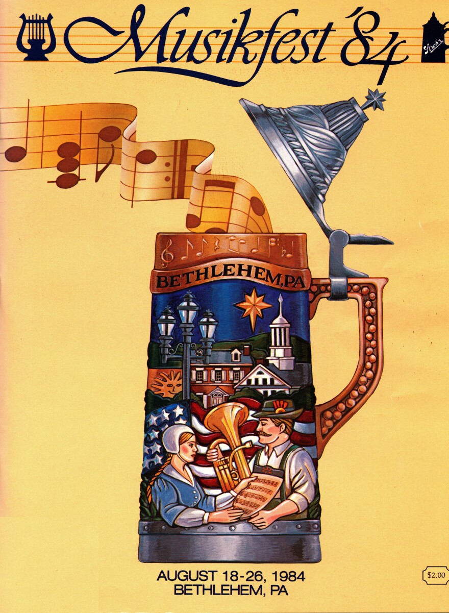
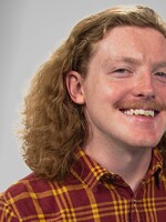
BETHLEHEM, Pa. — In the nearly 40 years since Linda La Due illustrated the program cover for the first Musikfest in 1984, she looks back on the impact her work has had with this observation:
“My paintings were my children, but my students were my masterpieces."
La Due said that's funny, because she never really expected to be an art teacher in the first place.
- Linda La Due, retired teacher, was the illustrator for some of the original Musikfest artwork
- She served as an art teacher at Parkland High School for 18 years
- She recently reflected on her experiences with art
La Due, who retired this year from Parkland High School after 18 years, has paved a path throughout her roles in education, advertising and even her personal works over the years.
During 15 of those 18 years, she said, she taught art to adult students in evening classes. She said some of those people still come by to collaborate, and the bunch has “so many easels it’s not even funny.”
She pursued other art opportunities across just about all of the United States and in many countries overseas, including Italy and Belgium. That work included painting murals and tiles, drawing, holding exhibitions and teaching.
“If you don’t have a really good idea, no matter how good you dress it up, it’s just not going to flow."Linda La Due, retired art teacher, on the importance of concepts
La Due said the most important lesson she shared with her students during this time was concept is king.
“If you don’t have a really good idea, no matter how good you dress it up, it’s just not going to flow,” she explained.

What led to the iconic 1984 Musikfest artwork
Back when La Due was younger, she said she was explaining to her dad that she needed her first easel.
“I was going to be a professional artist, and professional artists have easels,” she said.
She said her father responded that she eventually would go to Allen High School and learn under the direction of Jim Musselman.
“Jim was legendary as an art teacher,” La Due said.
She said her father had been part of a different teacher’s art class during his time at the same school, but he’d been around Musselman and posed for his students while they worked on portraits.
Time passed, and once La Due was a part of Musselman’s class and established herself with her quality of work, she spoke with him about her career goals.
She said she wanted to get into fine arts and painting for her degree path.
Musselman said she should consider trying her hand at graphic design and illustration, since it oftentimes could be a more interesting artistic route.
La Due also took part in school poster contests and drew for the school yearbook, so it was a no-brainer, she said.
She eventually made her way to Temple University's Tyler School of Art and Architecture and got a degree in graphic design and illustration.
The job hunt was on.
“I was talking to [Musselman] about it, he said, ‘Well those all sound like really great opportunities, but I really had hoped you’d come back to Allentown and work with me, Jamie and Bertie at an agency we’re gonna start.’”Linda La Due, reflecting on a conversation with her former art teacher and boss Jim Musselman
“I applied for jobs down in Philadelphia; a couple of them I was offered jobs,” she said. “I was talking to [Musselman] about it, he said, ‘Well those all sound like really great opportunities, but I really had hoped you’d come back to Allentown and work with me, Jamie and Bertie at an agency we’re gonna start.’”
Of course La Due made her way back to the Lehigh Valley to take that opportunity. What’s even better was that the Musselmans were filling out the new team with Jim Musselman’s former students and other people La Due happened to know.
“It was just, like, the perfect group,” she said. “It was people who were friends, people who had been in school together — and now we’re all going to work with this ad agency.
“And it was very, very exciting.”
When the conception of Musikfest came along, the agency was called upon to come up with advertising design concepts for the poster, catalogs, performance programs, billboards, logos and more.
“I thought, it’s this whole beer festival and Oktoberfest sort of thing, bringing in the German roots and the Moravian roots. The music that’s coming out of the top of the stein, there’s a little town of Bethlehem and just sort of tying all those little things together. That was what everything else kind of grew out from.”Linda La Due, looking back on the artwork's design
La Due said the poster was going to be the keystone project, one from which designs for the other projects came.
And similar to Musikfest founder Jeff Parks' experience when he came up with the event concept, she also drew inspiration for her design from a trip overseas to Germany the summer before.
“I thought, it’s this whole beer festival and Oktoberfest sort of thing, bringing in the German roots and the Moravian roots,” she said.
“The music that’s coming out of the top of the stein, there’s a little town of Bethlehem and just sort of tying all those little things together. That was what everything else kind of grew out from.”
She noted that in the program cover's design, the steel-like lid on top of the stein pays tribute to the city's steel-working tradition, complete with the Star of Bethlehem on top.
She said coming up with the designs was no easy feat — there was lots of brainstorming, note taking and sketching involved.
“You always want to illustrate something at least as large or a little bit bigger because once it reduces in size, it cleans up, everything looks lighter, everything looks more refined."Linda La Due, speaking on techniques
After developing a number of quick concept sketches, the team then would come up with about 20 concepts. From there, three to five of the ideas would proceed in the process.
She said the team made use of “a gazillion” Magic Markers, featuring colors that were matched with those that would eventually be coming off the printer.
“You always want to illustrate something at least as large or a little bit bigger because once it reduces in size, it cleans up, everything looks tighter, everything looks more refined,” La Due said.
When color sketches were complete, it was time to present to the client.
The design would later be photographed, and the logo and typography were completed using overlays.
The work would then be sent off to the printer.
Among their busy festival agenda at the agency, they also made time during the event to paint 4-by-8-foot murals on prepared pieces of plywood, all as festival-goers were passing by.
Different time, different methods
La Due spoke of the “by hand” and “paste-up” formatting steps that aren’t like what you see in modern publishing. That involved:
- Taking a logo, photographing it and sizing it up or down to make use within different formats
- Gluing that onto a board featuring indications of illustration placement to come
- That would be printed in a separate layer over top of the image
“It took maybe a couple days to do between photographing it and setting up the typography,” La Due said.
“Now you could do that in an afternoon or a couple hours, and you wouldn’t have to have the boards delivered and photographed.”
“It’s grown into this huge, huge thing, but it was really just kind of a very local Lehigh Valley little event that we didn’t know how it was going to take off. And it just, it caught fire.”Linda La Due, thinking back on the origins of Musikfest and what it's become
Along with the changing of these publishing methods over time, she said Musikfest also saw its fair share of evolution from its early, humble beginnings.
“It’s grown into this huge, huge thing, but it was really just kind of a very local Lehigh Valley little event that we didn’t know how it was going to take off,” she recalled. “And it just, it caught fire.”
A new — and unexpected — opportunity
La Due worked at the Musselman agency from 1981-86, taking part in developing the artwork for another couple of years after the inaugural Musikfest.
She left the Lehigh Valley and lived in different areas of the country, but still managed to help with concept sketches for some future posters.
She eventually made her way back to the United States for good, and came across a potential job at Parkland High School.
The catch?
The job was opening in less than a year. And while La Due had an appropriate degree to the subject, she held no teacher certificate.
That’s when she decided to jump feet-first into a two-year program at Kutztown University, signing up for 11 classes during her first semester.
“It was the best thing I could have ever done; I really, really enjoyed it. Never, in my opinion, ever had a bad student.”Linda La Due, reflecting on her education career
She said she even faced some doubt from the department chair. La Due said she assured them she was just fine, was making straight A’s and could handle the pressure.
She tackled her student teaching and class assignments, working at it on weekends and nights.
La Due said she went on to finish the program in time, applied for the Parkland job, got it, and went on to enjoy 18 years there.
“I had some students who have gone on to have careers in art that are absolutely fantastic, and I have some other kids that just did the paintings in my class. But every year, I hear from them at Christmastime. I get a card or something, and they’ll say, ‘I’ll never forget that time in class when I painted that flower.’”Linda La Due, reflecting on her former students keeping in touch with her later in life
“It was the best thing I could have ever done; I really, really enjoyed it,” she said. “Never, in my opinion, ever had a bad student.”
La Due said her experiences leading up to accepting the job not only set her up for success, but most importantly, it helped her to guide her students to be the best they could be.
“I had some students who have gone on to have careers in art that are absolutely fantastic, and I have some other kids that just did the paintings in my class,” she said.
“But every year, I hear from them at Christmastime.
"I get a card or something, and they’ll say, ‘I’ll never forget that time in class when I painted that flower.’”


